
Fast on a phone. Confident on every screen.

A practical approach to responsive web design, image delivery and performance budgets.

Let’s build something↗
DIGITAL EXPERIENCES / BUILT WITH INTENTCRAACT ↗
CRAACT JOURNAL / PRACTICAL GUIDE
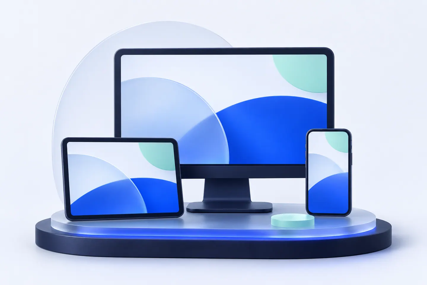
Responsive interface planes arranged across different screen sizes

A practical approach to responsive web design, image delivery and performance budgets.

Design the smallest journey first

A small screen forces useful decisions about content order, navigation and interaction. Plan the important visitor tasks at narrow widths, then let larger layouts add space and richer presentation.

Make imagery work harder

Serve compressed images at useful dimensions. Reserve their layout space to reduce page movement, lazy-load offscreen media and prioritize only the visual content needed for the first view.

Motion should support the experience

Animation can communicate hierarchy and personality, but it should not block essential tasks. Keep interactions responsive, consider reduced-motion preferences and verify that content remains available when a script is delayed.

Test real tasks

Check menus, forms, file uploads, long headings and sticky elements on small screens. A responsive layout is complete when the visitor can actually finish a task, not simply when the page fits the viewport.

Ready to build something useful?

Talk with Craact about your website, application or connected workflow.

Discuss your project↗
//
[ENGINEERING]&[POSSIBILITY]
//
[WEBSITES]&[EXPERIENCES]
//
[WORKFLOWS]&[AUTOMATION]
//
[CRM]&[CONNECTION]
//
[KNOWLEDGE]&[RAG]
//
[IDEAS]&[PRODUCTS]
//
[ENGINEERING]&[POSSIBILITY]
//
[WEBSITES]&[EXPERIENCES]
//
[WORKFLOWS]&[AUTOMATION]
//
[CRM]&[CONNECTION]
//
[KNOWLEDGE]&[RAG]
//
[IDEAS]&[PRODUCTS]
//
[ENGINEERING]&[POSSIBILITY]
//
[WEBSITES]&[EXPERIENCES]
//
[WORKFLOWS]&[AUTOMATION]
//
[CRM]&[CONNECTION]
//
[KNOWLEDGE]&[RAG]
//
[IDEAS]&[PRODUCTS]
//
[ENGINEERING]&[POSSIBILITY]
//
[WEBSITES]&[EXPERIENCES]
//
[WORKFLOWS]&[AUTOMATION]
//
[CRM]&[CONNECTION]
//
[KNOWLEDGE]&[RAG]
//
[IDEAS]&[PRODUCTS]
//
[ENGINEERING]&[POSSIBILITY]
//
[WEBSITES]&[EXPERIENCES]
//
[WORKFLOWS]&[AUTOMATION]
//
[CRM]&[CONNECTION]
//
[KNOWLEDGE]&[RAG]
//
[IDEAS]&[PRODUCTS]
//
[ENGINEERING]&[POSSIBILITY]
//
[WEBSITES]&[EXPERIENCES]
//
[WORKFLOWS]&[AUTOMATION]
//
[CRM]&[CONNECTION]
//
[KNOWLEDGE]&[RAG]
//
[IDEAS]&[PRODUCTS]
YOUR NEXT MOVE STARTS HERE

Your next chapter,
[ Connected ]
Let’s build it together.

Let’s talk
//
[ENGINEERING]&[POSSIBILITY]
//
[WEBSITES]&[EXPERIENCES]
//
[WORKFLOWS]&[AUTOMATION]
//
[CRM]&[CONNECTION]
//
[KNOWLEDGE]&[RAG]
//
[IDEAS]&[PRODUCTS]
//
[ENGINEERING]&[POSSIBILITY]
//
[WEBSITES]&[EXPERIENCES]
//
[WORKFLOWS]&[AUTOMATION]
//
[CRM]&[CONNECTION]
//
[KNOWLEDGE]&[RAG]
//
[IDEAS]&[PRODUCTS]
//
[ENGINEERING]&[POSSIBILITY]
//
[WEBSITES]&[EXPERIENCES]
//
[WORKFLOWS]&[AUTOMATION]
//
[CRM]&[CONNECTION]
//
[KNOWLEDGE]&[RAG]
//
[IDEAS]&[PRODUCTS]
//
[ENGINEERING]&[POSSIBILITY]
//
[WEBSITES]&[EXPERIENCES]
//
[WORKFLOWS]&[AUTOMATION]
//
[CRM]&[CONNECTION]
//
[KNOWLEDGE]&[RAG]
//
[IDEAS]&[PRODUCTS]
//
[ENGINEERING]&[POSSIBILITY]
//
[WEBSITES]&[EXPERIENCES]
//
[WORKFLOWS]&[AUTOMATION]
//
[CRM]&[CONNECTION]
//
[KNOWLEDGE]&[RAG]
//
[IDEAS]&[PRODUCTS]
//
[ENGINEERING]&[POSSIBILITY]
//
[WEBSITES]&[EXPERIENCES]
//
[WORKFLOWS]&[AUTOMATION]
//
[CRM]&[CONNECTION]
//
[KNOWLEDGE]&[RAG]
//
[IDEAS]&[PRODUCTS]